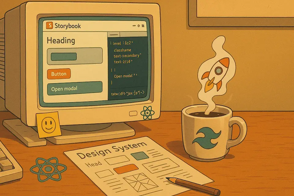
How to Create a Design System with Storybook and Tailwind (React) - A Step-by-Step Guide

Ever felt overwhelmed trying to maintain consistency across your React applications? You’re not alone!
In this hands-on guide, I’ll walk you through creating a powerful design system using Storybook and Tailwind CSS in React. Whether you’re a solo developer or part of a team, you’ll learn how to build maintainable, scalable UI components that will make your development process a breeze. 🚀
What is a Design System? 🤔
A design system is your secret weapon for building consistent, maintainable user interfaces at scale. Think of it as your project’s DNA 🧬 - a collection of reusable components and guidelines that work together harmoniously.
Why You Need One 🎯
- Consistency: Ensure your UI speaks the same visual language across your entire application
- Efficiency: Build new features faster by reusing existing components
- Maintainability: Make changes once, see them reflected everywhere
- Collaboration: Provide a single source of truth for designers and developers
In this guide, I’ll show you how to harness the power of Storybook and Tailwind CSS to create a robust design system in React that your team will love using.
Why Storybook + Tailwind = Perfect Match 💪
Let’s talk about why this dynamic duo is the perfect choice for your design system:
Storybook 📚
- Build and test components in isolation
- Interactive documentation that stays up-to-date
- Visual testing and debugging made easy
- Perfect for component-driven development
Tailwind CSS 🎨
- Utility-first approach for rapid styling
- Consistent design tokens out of the box
- Highly customizable to match your brand
- Zero-runtime CSS for optimal performance
Together, they create a powerful workflow that makes building and maintaining design systems a breeze! 🚀
Let’s setup our project
To get started, we need to create a new project in this case we’re going to use Vite, I’m going to assume you have Node.js installed in your machine, and already knows how to create a React project, if you don’t you can follow the official documentation here.
You can create a new project (React) using the following command:
pnpm create vite my-design-system --template react-tsI’m using pnpm as my package manager, but you can use npm, yarn or bun if you prefer. Also, it’s important to mention that I’m using TypeScript. This will help us to have a better development experience, having our components typed will give us autocompletion and type checking for our components.
Now that we have our project created, let’s install Storybook and Tailwind CSS.
Setting Up Tailwind CSS 🎨
First, let’s add the power of Tailwind CSS to our project. This will be the foundation of our design system’s styling, you can do this following the official documentation here , or you can follow the steps below:
pnpm install tailwindcss @tailwindcss/vite🔧 Configuration time! Let’s set up our Tailwind configuration:
- First, create a
tailwind.config.tsfile:
pnpm dlx tailwindcss init -p- Update your
vite.config.tsto integrate Tailwind:
import { defineConfig } from 'vite';
import tailwindcss from '@tailwindcss/vite';

export default defineConfig({
  plugins: [tailwindcss(), react()],
});
And finally in your main CSS file (usually src/index.css) you need to import Tailwind CSS:
@import 'tailwindcss';Installing and Configuring Storybook 📚
Now that we have Tailwind up and running, let’s add Storybook to our toolkit. Storybook will be our component playground and documentation hub, you can install it following the official documentation here, or you can follow the steps below:
Run the following command:
pnpm create storybook@latest🎯 Quick Setup Guide During installation, you’ll see several options. For this tutorial:
- ✅ Documentation (Required)
- ❌ Uncheck other options (We can add them later if needed)
The installer will:
- Add Storybook dependencies
- Create initial example stories
- Set up configuration files
- Add npm scripts to your package.json
Once installed, you can launch Storybook’s development server:
pnpm storybookYour component playground will be available at http://localhost:6006 🚀
Creating Your Design System Foundation 🎨
Defining Custom Colors and Tokens
Before diving into components, let’s establish our design system’s foundation: the design tokens. These are the basic building blocks that will ensure consistency across your entire application.
🎨 What are Design Tokens? Design tokens are the smallest units of your design system. They represent:
- Colors
- Typography
- Spacing
- Shadows
- Animation timings
- And more!
Setting Up Design Tokens
I want this design system to be modular and easy to maintain, so I’m going to create a new css file for our custom colors and tokens, you can omit this step if you want, but I think it’s a better approach to have this separated from the main css file.
Create a new file in your css folder: First I’ll create a folder called
cssunder thesrcfolder, and then I’ll create a new file calleddesign-tokens.css.For this guide, we’ll focus on a simple but effective color palette:
- 🟢 Primary: Soft sage green
- 🔵 Secondary: Deep teal
- 🟡 Accent: Vibrant orange
- ⚪ Background: Warm white
The content of our design-tokens.css file will be:
@theme {
  --color-primary: #c1d8c3;
  --color-secondary: #6a9c89;
  --color-accent: #ffa725;
  --color-background: #fff5e4;
}
Setup our design tokens in Tailwind
Now that we have our design tokens defined, we need to include them in our main css file to be able to use them in our components, we can do this by adding the following code to our index.css file:
@import 'tailwindcss';
@import './css/design-tokens.css';
That’s it, now we have our custom colors and tokens defined in our Tailwind configuration, we can use them in our components, this will help us to have consistent colors across our application.
Organizing our Design System
We already have our project ready to start working on our design system, but before we start creating component, we’ll create a folder structure to organize our design system, this will help us to have a better understanding of our components and make it easier to maintain them.
🧬 Atomic Design Structure
The folder structure is going to be based on the Atomic Design principles, if you’re not familiar with this concept, I highly recommend you to read the book Atomic Design, by Brad Frost, it’s a great book that explains the concept of Atomic Design and how to apply it in your projects.
🌳 Project Structure:
src/
├── components/
│   └── design-system/
│       ├── atoms/          # Basic building blocks (buttons, inputs, texts)
│       ├── molecules/      # Simple component compositions
│       └── organisms/      # Complex component compositions
Atoms (
atoms/)- Fundamental building blocks
- Cannot be broken down further
- Examples: buttons, inputs, labels, headings
- Should be highly reusable and context-independent
Molecules (
molecules/)- Simple combinations of atoms
- Have a single responsibility
- Examples: search bars (input + button), form fields (label + input)
- Should focus on one specific interface task
Organisms (
organisms/)- Complex UI sections
- Composed of atoms and molecules
- Can be context-aware
- Examples: navigation bars, footer sections, forms
- Represent distinct sections of an interface
This structure helps maintain a clear separation of concerns and makes it easier to manage component complexity as your design system grows.
Building Our First Component 🏗️
Time to get hands-on! Let’s create our first component: a flexible heading component that will demonstrate key concepts of component development with Storybook and Tailwind.
Setting Up Utility Functions 🛠️
Before diving into component creation, let’s set up some essential utilities that will make our lives easier:
First, create a utilities directory Inside the
srcfolder create a new folder calledlib, and inside this new folder create a file calledutils.ts.Install the required dependencies:
pnpm add clsx tailwind-merge class-variance-authority💡 Why these packages?
- clsx: Utility for constructing className strings
- tailwind-merge: Smart way to merge Tailwind classes without conflicts
- class-variance-authority: Type-safe variant management for components
- Create our class merging utility in
src/lib/utils.ts:
import { clsx, type ClassValue } from "clsx";
import { twMerge } from "tailwind-merge";

export function cn(...inputs: ClassValue[]) {
  return twMerge(clsx(inputs));
}
};
Component Requirements 📋
Let’s create a heading component that showcases best practices for our design system. Our component will be:
✨ Features:
- Multiple variants (primary, secondary, accent)
- Semantic heading levels (h1-h6)
- Type-safe props
- Customizable via className
🎯 Technical Requirements:
interface HeadingProps {
  variant?: 'default' | 'accent';
  level: 'h1' | 'h2' | 'h3' | 'h4' | 'h5' | 'h6';
  className?: string;
  children: React.ReactNode;
}
Create the component
Under the atoms folder, create a new folder called heading/, and inside this folder create a new file called heading.tsx and a file called heading.stories.ts.
First, in our heading.tsx file, we’re going to define our heading component, the content of this file will be:
import { cn } from '@/lib/utils';

export default function Heading({ className, level, variant = 'default', children }: HeadingProps) {
  const Heading = level;

  return (
    <Heading
      className={cn(
        'font-normal',
        variant == 'accent' && 'text-accent',
        variant == 'default' && 'text-secondary',
        className
      )}
    >
      {children}
    </Heading>
  );
}

export type HeadingProps = {
  children: React.ReactNode;
  level: 'h1' | 'h2' | 'h3' | 'h4' | 'h5' | 'h6';
  className?: string;
  variant?: 'default' | 'accent';
};

export { Heading };
As you can see in our new file, we created a basic heading component that supports different variants, heading levels and custom classes. We are using our design tokens previously defined in our CSS file with Tailwind, and now we can use this component throughout our application.
An implementation of this component would look something like the following code:
<Heading level="h2">Now our component is working 🙌</Heading>Level Up: Adding Type-Safe Variants 🚀
Our heading component works, but let’s make it more robust and maintainable using class-variance-authority (CVA). This powerful tool will help us:
✨ Benefits of Using CVA:
- Type-safe variants and combinations
- Autocomplete support in your IDE
- Cleaner, more maintainable code
- Easy to scale with new variants
Refactoring Our Component
Let’s transform our heading component into a more powerful, flexible version. We’ll add:
- Multiple size options
- Text alignment controls
- Default fallbacks
Here’s our enhanced heading.tsx:
import { cn } from '@/lib/utils';
import { cva, type VariantProps } from 'class-variance-authority';

export default function Heading({
  className,
  level,
  variant = 'default',
  size = 'base',
  align = 'left',
  children,
}: HeadingProps) {
  const Heading = level;

  return (
    <Heading className={cn(headingVariants({ variant, size, align }), className, 'font-normal')}>{children}</Heading>
  );
}

const baseClasses = 'font-normal';
const headingVariants = cva(baseClasses, {
  variants: {
    variant: {
      default: 'text-secondary',
      accent: 'text-accent',
    },
    size: {
      sm: 'text-sm',
      base: 'text-base',
      lg: 'text-lg',
      xl: 'text-xl',
      '2xl': 'text-2xl',
      '3xl': 'text-3xl',
      '4xl': 'text-4xl',
    },
    align: {
      left: 'text-left',
      center: 'text-center',
      right: 'text-right',
    },
  },
  defaultVariants: {
    size: 'base',
    align: 'left',
    variant: 'default',
  },
});

export type HeadingProps = {
  children: React.ReactNode;
  level: 'h1' | 'h2' | 'h3' | 'h4' | 'h5' | 'h6';
  className?: string;
} & VariantProps<typeof headingVariants>;

export { Heading };
🔍 Code Breakdown:
- Base Styles: We define common styles that apply to all headings
- Variants: Each variant group (
variant,size,align) represents a different aspect of customization - Type Safety: Full TypeScript support with exported types
- Extensibility: Custom className support for additional customization
Usage Examples 🎯
// Basic usage
<Heading level="h1">Welcome to our app</Heading>

// With variants
<Heading
  level="h2"
  variant="accent"
  size="2xl"
  align="center"
>
  Featured Products
</Heading>
Creating Rich Documentation with Storybook 📚
Let’s create the Storybook documentation for our heading component. We can declare these files wherever we want provided that we follow the *.stories.ts pattern. Storybook will automatically detect this file as a Storybook story (I like to keep the story docs inside a folder with its corresponding component file to keep it easy to maintain and identify).
Our file it’s heading.stories.tsx:
import type { Meta, StoryObj } from '@storybook/react';
import { Heading } from './heading';

const meta = {
  title: 'Design System/Atoms/Heading',
  component: Heading,
  argTypes: {
    level: {
      control: 'select',
      options: ['h1', 'h2', 'h3', 'h4', 'h5', 'h6'],
    },
    size: {
      control: 'select',
      options: ['sm', 'base', 'lg', 'xl', '2xl', '3xl', '4xl'],
    },
    align: {
      control: 'select',
      options: ['left', 'center', 'right'],
    },
    variant: {
      control: 'select',
      options: ['default', 'accent'],
    },
  },
  args: {
    level: 'h1',
    children: 'Heading',
    variant: 'default',
    align: 'left',
    size: 'base',
  },
} satisfies Meta<typeof Heading>;
export default meta;

type Story = StoryObj<typeof meta>;

export const Playground: Story = {};

export const Default: Story = {
  args: {
    level: 'h1',
    children: 'Default Heading',
    variant: 'default',
    align: 'left',
    size: 'base',
  },
  argTypes: {
    variant: {
      table: {
        disable: true,
      },
    },
  },
};

export const Accent: Story = {
  args: {
    level: 'h1',
    children: 'Accent Heading',
    variant: 'accent',
    align: 'left',
    size: 'base',
  },
  argTypes: {
    variant: {
      table: {
        disable: true,
      },
    },
  },
};
We already have our first story in Storybook and can interact with it. However, if we run the Storybook command, our components will appear unstyled. This is a known issue with TailwindCSS and Storybook. To fix this, we need to import our styles in the Storybook environment to let it know we’re using Tailwind.
Let’s add the following code to our .storybook/preview.ts:
import "../src/index.css"; // Import the main CSS styles file

const preview: Preview =
//...
Preview Your Component 🖼️
When you run Storybook now (pnpm storybook), you’ll see a rich documentation page with:
- Interactive controls
- Various examples
- Props documentation
- Live preview
🎯 Wrapping Up: Your Design System Journey
Congratulations! 🎉 You’ve just built the foundation of a professional design system using some of the most powerful tools in modern web development.
If you want to check the code in github here’s the repo LINK
Let’s recap what we’ve accomplished:
🏗️ Core Foundations Established
- Integrated Storybook for component documentation and testing
- Implemented TailwindCSS for utility-first styling
- Created a scalable design tokens system
- Built a flexible heading component with type-safe variants
🎨 Design System Architecture
- Organized components using Atomic Design principles
- Implemented type-safe component variants with CVA
- Created reusable utility functions for styling
- Set up a maintainable project structure
📚 Development Best Practices
- Used TypeScript for type safety and better DX
- Implemented CVA for variant management
- Created comprehensive Storybook documentation
- Set up a modular and scalable architecture
Next Steps 🚀
To continue building on this foundation:
Expand Your Component Library
- 🔘 Create Button components with variants
- 📝 Build Form elements
- 🎨 Implement Card layouts
Add Advanced Features
- 🌓 Dark mode support
- 🌐 Internationalization
- 📱 Responsive design patterns
Enhance Developer Experience
- 🔄 Set up CI/CD for your design system
- 📊 Add performance monitoring
- 📱 Create mobile-first variants
Documentation & Maintenance
- 📘 Write comprehensive documentation
- 🧪 Add more test coverage
- 🔄 Set up regular updates
Found this helpful? Follow me on social media (LinkedIn especially) for more tutorials on web development, productivity tips, and more.
💡 Pro Tips for Success:
- Start with core components and expand gradually
- Maintain strict type safety across your system
- Document everything, especially edge cases
- Test components thoroughly before adding to production
- Keep your design tokens synchronized with your design team
Share your design system implementations with me – I’d love to see what you build! Feel free to reach out on social media. 🌟